the challenge
This theoretical concept was an effort to make UX inroads into Boeing, whom we already had a well established relationship with. The design challenge was presented as a mobile app that could be used to track expo events at Boeing. Due to the literal size of Boeing's products and their facilities, the expo happens across large areas and differing facilities, so keeping track of what is happening, what you might want to attend and how things relate in terms of location and timing is very difficult. The idea was a mobile app that would help with organizing this information, so that expo attendees could get the most out of the event.
gathering
The design process began with working with an internal relationship manager to understand the concept, its needs, demands and pain points, and what had already been imagined. Since this was a recommendation project and not an actual planned one, this was my single point of contact. I was given free rein to research and conceptualize as I saw fit, adding features and concepts as needed. I essentially took what little I was given in terms of understanding and ran with it, adding new ideas and features not a part of the original discussion.
research
Following that discussion came research and materials gathering. I was able to grab logos, received a style guide, grabbed stock images and then researched Boeing public facing products that existed, such as their website, so that I could mimic to some degree their look and feel.
design
Initial designs were in the form of paper thumbnails and wireframes. I find this tried and true method huge for brainstorming ideas and hammering out concepts quickly. I still use this method today, although I primarily do so digitally with an ipad and pencil. A bit of impromptu card sorting was also part of the process, both physically and digitally, in order to establish some basic imagined feature flows.
the solution
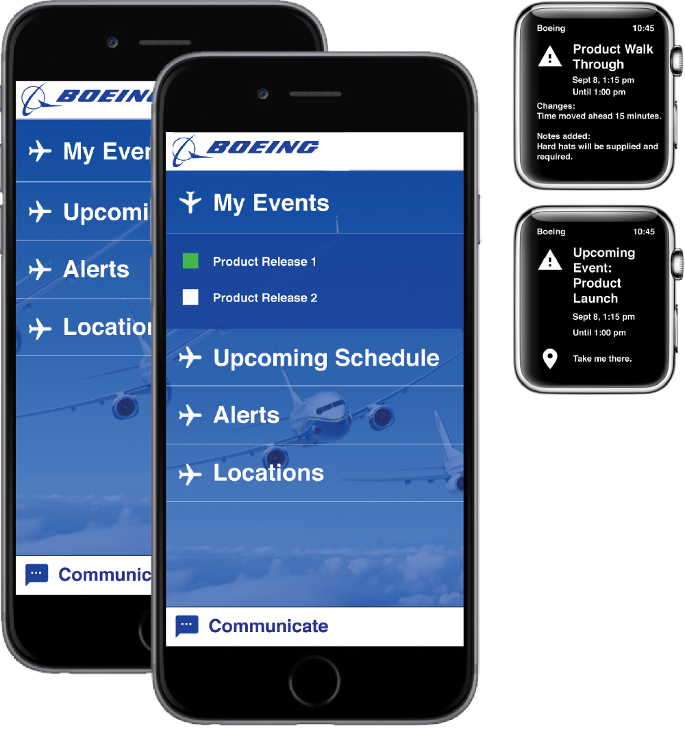
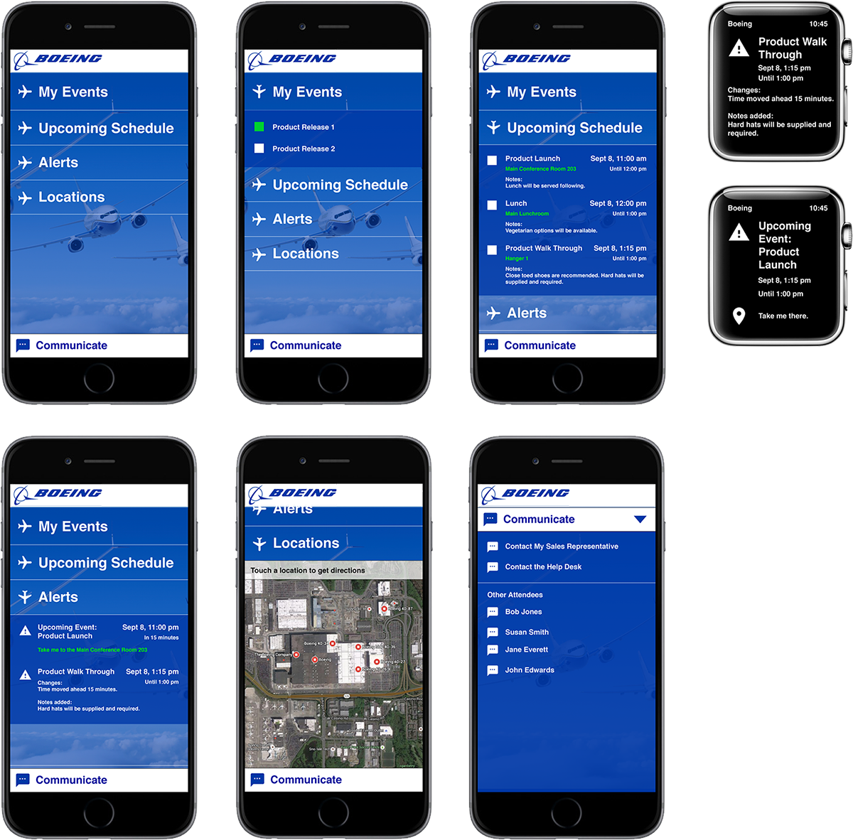
The solution was an app concept that organized event favorites, a personal schedule, alerts and locations in one place. Users could see their saved events, their upcoming schedule and schedule conflicts. They could be alerted to schedule and venue changes or cancellations. Map functions could help users find events as well as get walking and driving directions to different events. Users could communicate with colleges directly in the app and even speak to their sales person. Apple Watch integration gives reminders and notifications to users on the fly as well as way finding.
results
The resulting deliverable was a visual mock up created in Illustrator and Photoshop that consisted of six high fidelity screen mock ups plus two Apple Watch mock ups. This deliverable was part of a presentation to the business and it was very well received. The Apple Watch integration was not part of the initial design concept and was something I had conceived and added. It was this feature of the app that put the concept over the top and won us some favor.
As a result, we did make inroads into Boeing in terms of UX. One of the projects that was a direct result of this design exercise was Boeing CACTUS. I was presented to fill a role in this project as a senior level UX designer and this concept came up again and was presented. I would work on the Boeing CACTUS project for a little over a year.