the challenge
The OWL project was a reimagination and modernization of an existing 15 year old tool used by the warranty department. The Online Warranty Link, or OWL, is used to enter and track the warranty information of their Freightliner brand of trucks. One of the needs was to reduce the amount of screens by 50% by combining screens and functions together where it made sense. The other was to make the interface easier to use and follow and reduce pain-points, thus reducing a training need. I also had an additional challenge of key stakeholders that ran the full spectrum in terms of expectations: One that wanted to create something completely new and another that didn't want to change anything and still others that fell in between those two extremes. All stakeholders and users would need to be won over in order to get buy-in for the full project. This portion of the project was only to redesign one small section of the tool and gain buy-in for the direction and concept for the full project.
gathering
The design process began with working with our internal project lead, who was also the subject matter expert for this system. We spent numerous hours together discussing how OWL worked and its importance and connections to other systems, how it was used and key features. We discussed the reported pain-points and issues that the current system had and its relative failures. I followed those discussions with conducting initial stakeholder interviews to gather first hand information about pain-points and desires.
research
Research and materials gathering followed. I conducted an early high level heuristic evaluation for presentation to the key stakeholders. We conducted many information gathering and design workshops with key stakeholders to gather direct feedback and pain-points and refine the wishlist and must haves. I received logos and a current style guide and an in process interface pattern library from internal designers. I presented the heuristic to stakeholders and the result was both agreement and some eye opening insights from both sides.
design
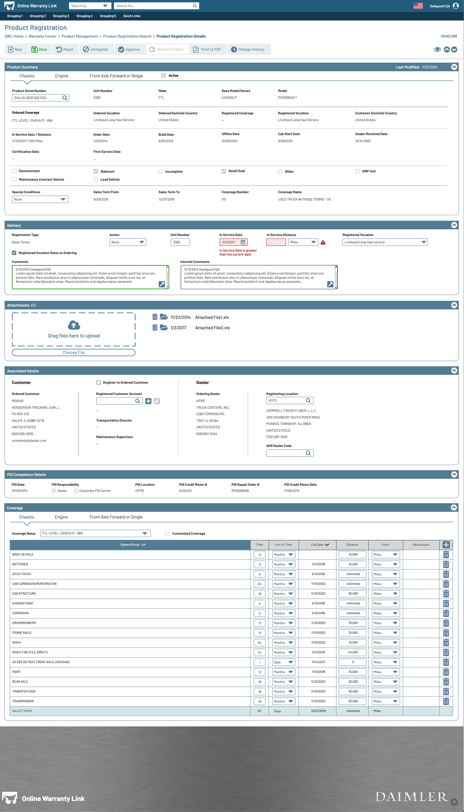
Designs started with digital thumbnails and very low fidelity wireframes, although due to time constraints, they were never presented to the business. Instead, these basic designs were translated into quick Axure mock ups. During one of the design workshops, the stakeholders were shown a sneak peek of the in process designs and they were very well received, despite not being anywhere near complete. The primarily complete design concept and its features were later presented. Several rounds of refinement and feedback workshops solidified details and fine points.
the solution
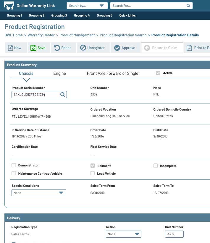
The solution was a design that paid homage to the original tool, and thus retaining much of users muscle memory, while fixing and addressing all pain-points of the existing tool to work more easily and logically with less effort and in fewer clicks. For a tool that is essentially a very large form, better use of space makes for better readability. Collapsible sections and the ability for the system to remember the users preferred view reduced page scrolling by 50%. More intelligent process flows eliminated confusion and disorientation.
results
The resulting deliverables were a preliminary heuristic evaluation and Axure visual mock ups for five screens. This heuristic evaluation was well received and insights were gathered and applied. The Axure mock ups were extremely well received and essentially won over every stakeholder, each one expressing excitement about where the project was headed and the desire for it to be completed already so they could start using it today. This was a huge win for us. The full project was to begin in the new year.